What makes a B2B landing page convert
A B2B landing page converts when it matches the click intent, and asks the user to do something they actually want to do.

The short answer
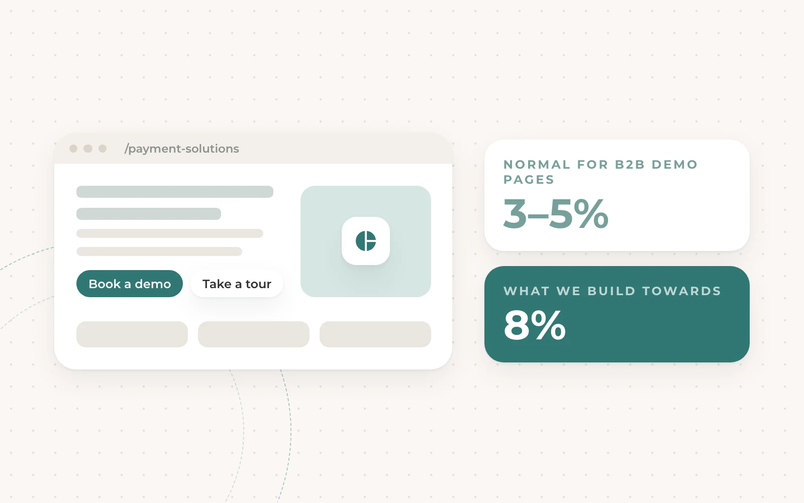
The most common reason Google fails for B2B is that the traffic lands on a bad page. We got tired of complaining about it, so we started building the pages ourselves. For a B2B demo page, 1 to 2% is normal. But there are ways of getting a CVR as high as 10%, but you have to build an experience, not a landing page.
Three types of people land on your page
Some want to talk to sales. Some want to learn more but don’t want to talk to sales. And some don’t want to learn more at all. Most pages are built for the first group only. One button, book a demo, and the biggest group has nowhere to go.
Every page we build gives people a choice: a demo for the ones ready to talk, and a self-learning route, like a tour or an audit, for the ones who don’t want a sales demo. If possible we try to embed a get started for free, or test it for free type CTA too.
Six things every above the fold needs
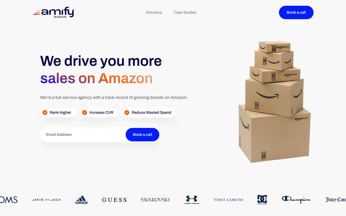
The above the fold is your first impression, so make a good one. It has to do six jobs at once: a nav with the links that matter, a headline that makes the product instantly clear, a nice visual, social proof, a few bullet points around USPs, and a good conversion action.
Here’s a real one with all six ticked off. Nothing clever, nothing missing.
Ask for one thing first
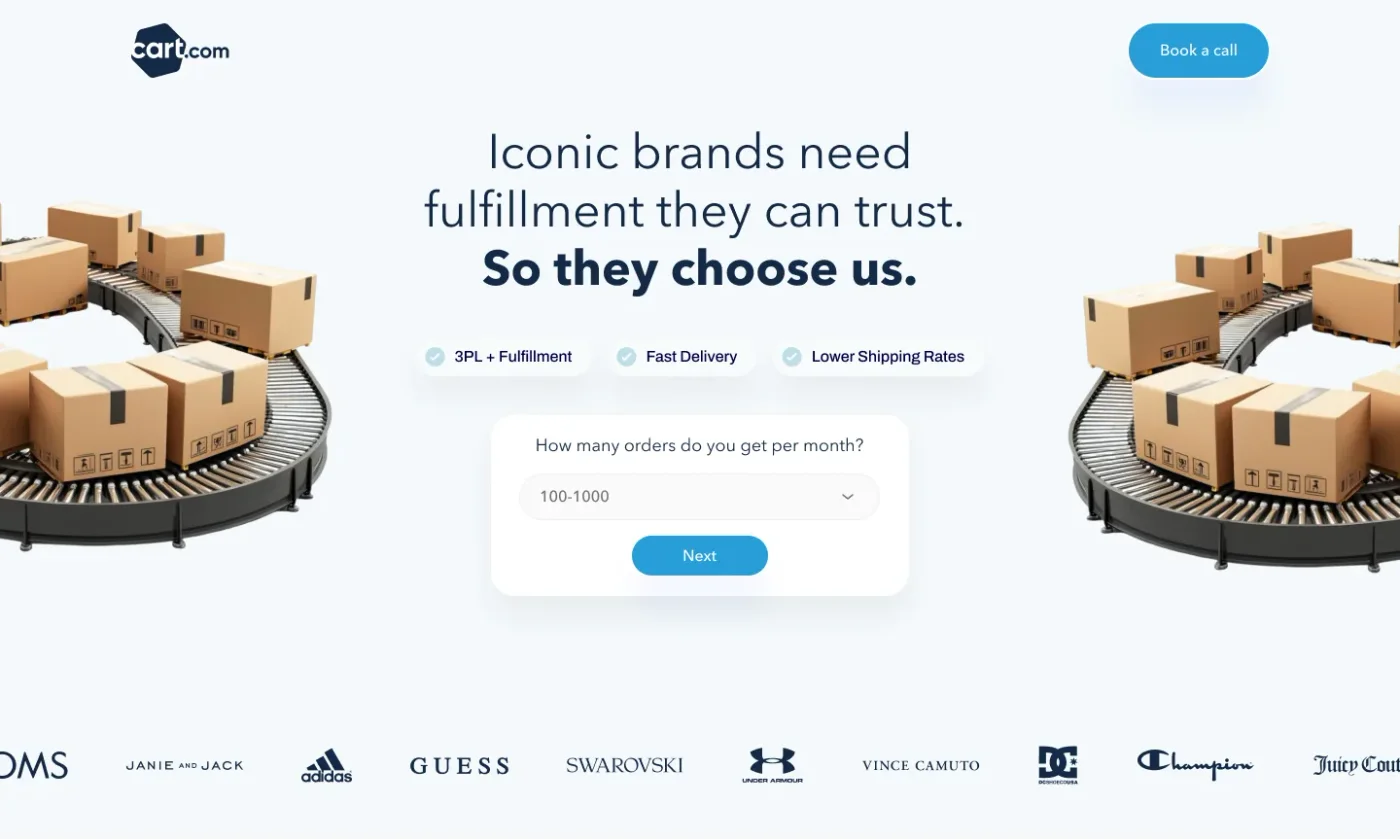
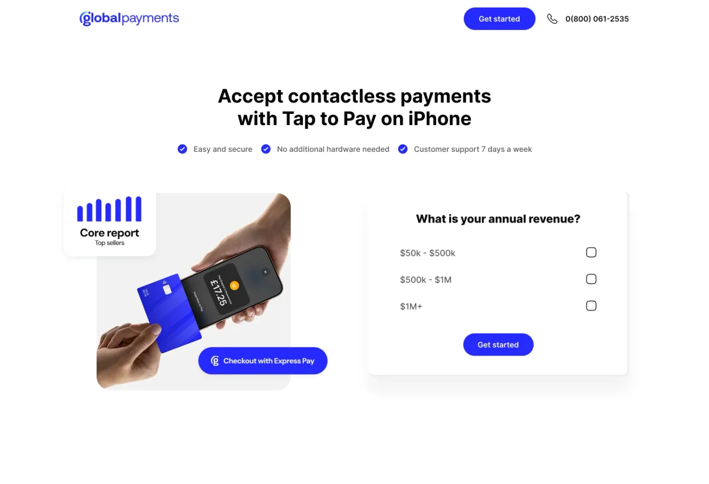
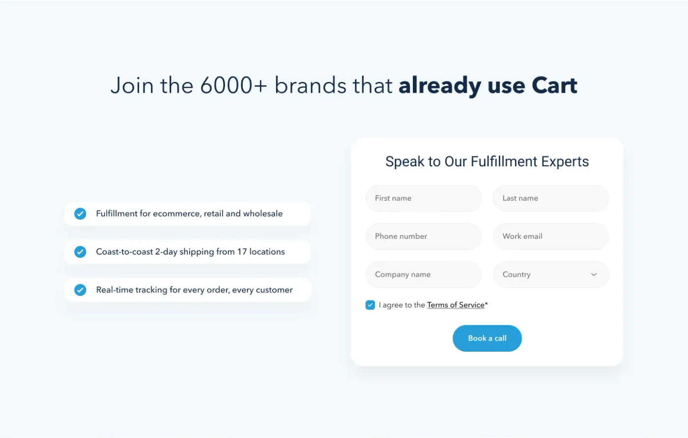
If you have to push for a demo, a form with seven fields scares people away. The highest converting pages we build start with a question, not an email address. How many orders do you get a month? What’s your annual revenue? Then you ask the others needed on your demo form after.
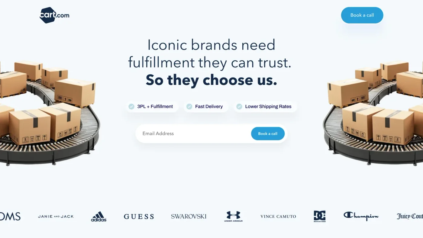
If you need an email, make it the only field you ask. Everything else on the next step. And don’t block personal emails. Just ask them for more information if the address doesn’t tell you enough, such as company URL and job title. In general though, the goal is to not scare them away with a big form.
These four pages are from our library. Click one to open it.
Five tricks to increase your CVR
Every page we build has the same five things: a demo CTA for people ready to talk, a self-learning CTA for people who want to look around first, a conversion pop-up for people about to leave, copy written for humans not boring B2B jargon, and CRO principles all the way down the page.
CRO principles are other things that just help with digestion on a page. Make sure the copy is short, a spacious design which is good on mobile and desktop. All the visuals add something, rather than just being images for the sake of it. Buttons all the way down after sections. Sections optimised to fully display in a full screen load, rather than overlapping across two.
Use pop-ups to catch people on the way out
Most of the people who land on your page leave without doing anything. A pop-up gives them one more chance to say yes, and it lifts the conversion rate of the action you care about.
You can trigger it three ways: on exit intent, when the mouse heads for the tab bar; on scroll, once they’ve read enough to be interested; or on time. Time is the one we use most, usually pushing it 15-20 seconds into a visit as a prompt to take the next step.
Build in blocks, not from scratch
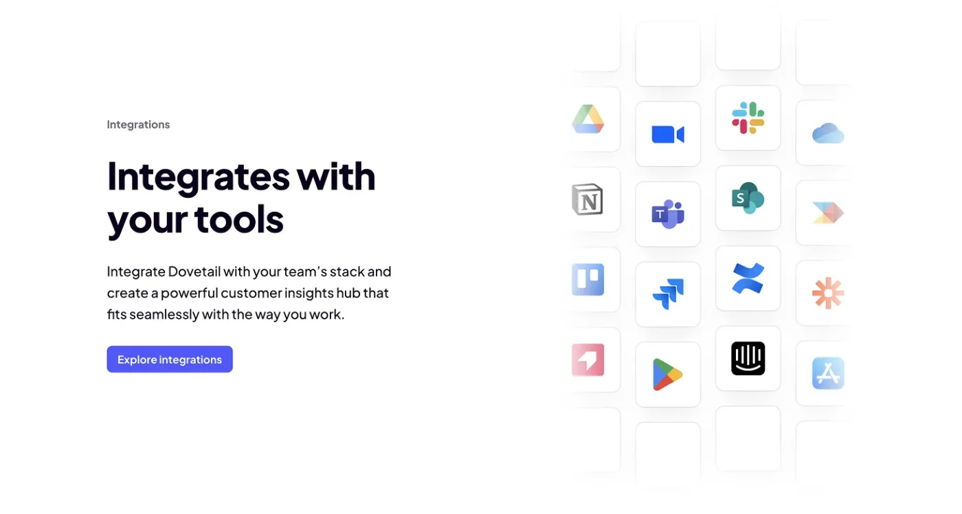
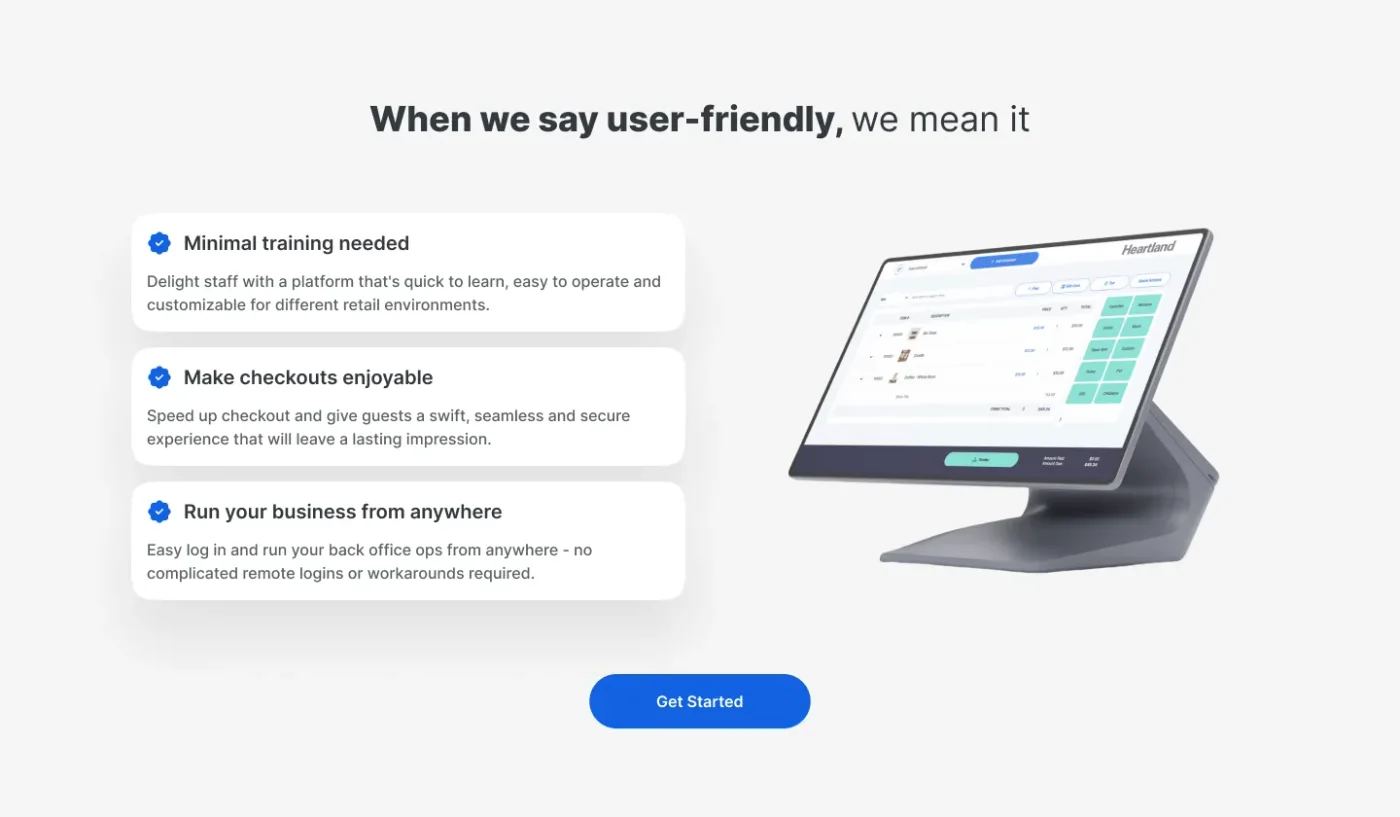
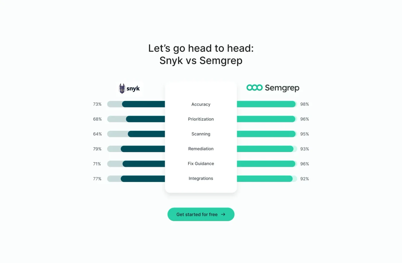
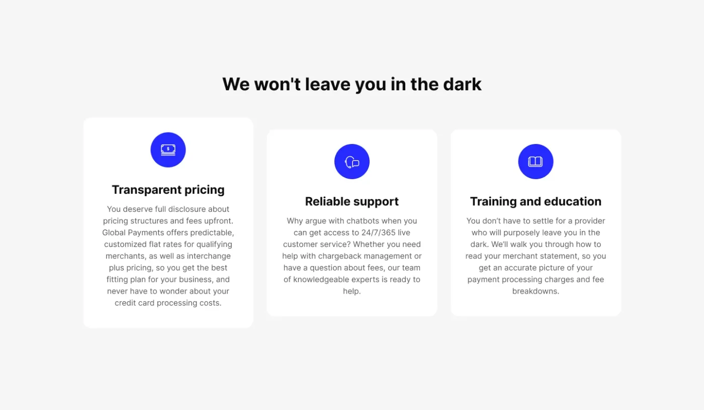
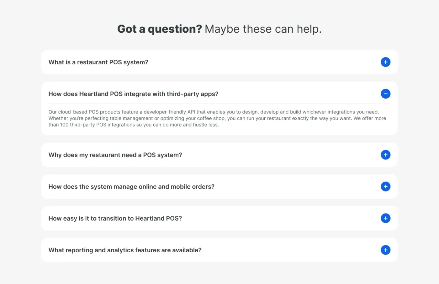
A good landing page is a story told in blocks. The above the fold sets up the intro, then each block answers the next question in the buyer’s head: who else uses it, what does it look like, how does it compare, what does it cost, what if I have a question.
When you build pages in blocks, it’s easier to make sure you don’t repeat yourself too much and each block brings something different.
Check it before it goes live
Anything that can go wrong, will go wrong when it comes to new pages. Once they are built, they need a full QA, testing anything that could go wrong. Go through the same list every time, and test mobile, desktop, buttons, forms, tracking and anything else you can think of. It’s worth using Claude to do a proofread as well, as things can get missed. We also do a full audit with Lighthouse before it goes live, to spot any technical issues that could increase speed.
Then keep testing
A launched page is a first draft. We constantly test layouts, copy, offers, conversion actions and above the fold designs. One change at a time, so we know what actually made the difference. The winner gets rolled into every page we build after it.
The takeaway
Match the page to the click, get the above the fold right, ask them to do something reasonable. What you ask them to do is usually the biggest factor in whether or not they will convert. Booking demos is something people actively try to avoid, so offer something else too.
In this article
- Drive More Meetings
- Increase Pipeline
- Strategies That Work
We run LinkedIn and Google Ads for B2B brands, and we’re good at it.

More articles
Back to blog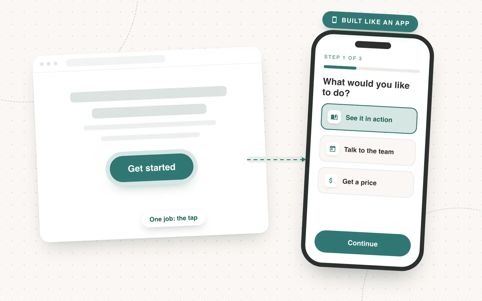
Landing Pages
Creating experiences that drive up conversion rate
Slapping a form on a landing page isn’t optimising for conversion. Build an experience people want to go through, starting on the phone.
Joseph Hill4 min read
LinkedIn Ads
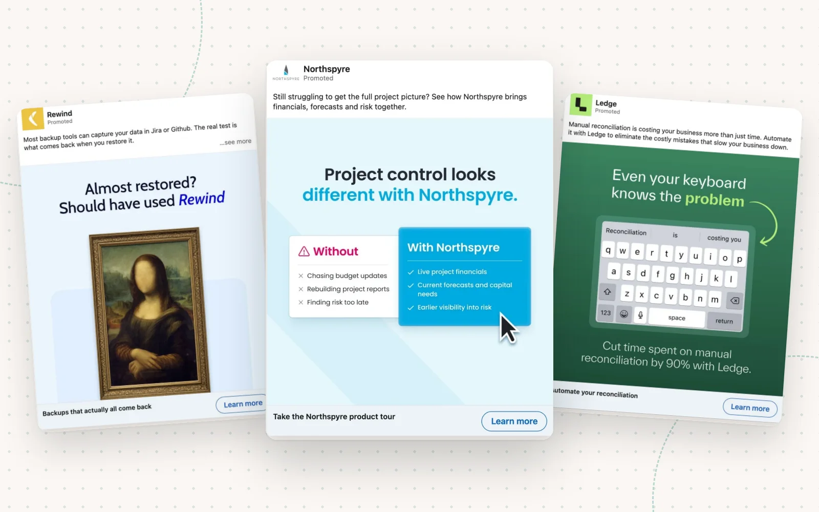
How to make B2B ads for paid social that don’t suck
Most social ads get scrolled past because they’re boring. Create a clear problem story and use these techniques to make your ads, and you won’t be ignored.
Joseph Hill5 min read
LinkedIn Ads
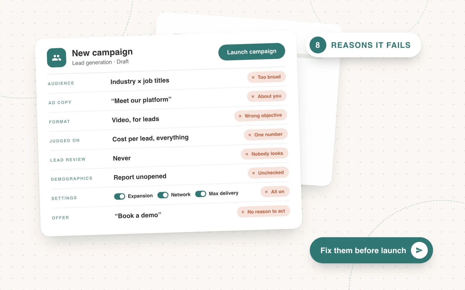
8 reasons why most LinkedIn campaigns fail before they even start
Most LinkedIn campaigns fail before they even start: the audience is too broad, the ad is about you, and every campaign is judged on one number.
Joseph Hill5 min read